David Shrigley.

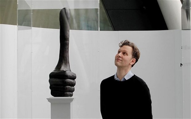
David Shrigley is a visual artist and illustrator from Cheshire, now based in Glasgow where he graduated with a degree in Environmental Art in 1991. He has produced work in many differing mediums, directing music videos for Blur’s “Good Song” and Bonnie ‘Prince’ Agnes’ “Queen of Sorrow” and in 2013 Shrigley was nominated for the Turner prize for his really good “Really Good” sculpture which is to be installed on Trafalgar Square’s fourth plinth in 2016. Shrigley’s work is easily identifiable for its dark, dry comedy and this most often takes on the form of crude hand drawn illustrations which are simplistic and produced on mass, appearing in large collections as a surreal stream of conscious, like a modern day beat illustrator but in place of starry eyed romanticism instead a grounding in everyday feeling and fears takes its place.

davidshrigley_2815161b

“As an artist you have to feel your art makes the world a better place and you have to believe that quite sincerely, otherwise why would you make it?”

Shrigleys work is bold and designed to invoke a personal reaction within a viewer, these reactions tread a fine line between laughs and more serious contemplation. There’s something distinctly british and satirical to his work, particularly in the text that accompanies the bulk of his illustration, often captioning or working with images in interesting, witty or conflicting ways.

2

“I only do anything once. That’s the rules.”

Shrigley’s working methods have an interesting sense of permanence for what are often fleeting feelings or statements. He uses black ink and brush or water based marker pens and produces high volumes of work refusing to redraw any of his work, his mistakes and crossings out becoming a part of the work itself. Shrigley’s entire methodology seems to be centred around feelings of varying specificity and how to thoroughly communicate them. Frankly speaking Shrigley’s drawings being more technically proficient or time consuming would serve no purpose as the blunt force of his roughshod black-on-white line drawings communicates his soundbite mantras perfectly.

“Another method is to write a list of things to draw before I start: a tree, an elephant, a lorry, an orgy etc. This gives each drawing a starting point. Once I have started, the drawing usually manages to get somewhere. I think the starting point is important for an artist. Once you’ve started the battle is half won.”

EXHI029434David-Shrigley

David Shrigley @ OFFSET 2009:

Shrigley is part of/partly responsible for the massive resurgence in hand drawn elements of popular illustration. In an art form becoming increasingly overwhelmed by technological advances, where any mistake or imperfection can be rubbed out and remade and text is completely uniform; it is refreshing to see Shrigley’s uneven handwriting spilling out his trademark gallows humour. There’s an interesting connection between the distinctly human funny (ha-ha & odd) situations he create and the imperfect and human way he realises them.

b2f6296b-6c13-48e0-8720-de40996ff601-1472x2040

I gravitate toward artists that a distinct personality and voice and reject the occasionally aloof and detached attitudes that seem to permeate the artistic community.

1ec1108f-1108-402d-9765-b9f9adf999f7-1484x2040

 “It is what it is”

Shrigley is interesting in the fact that he is a Fine artist that (this may be less true now, but was more so when he began producing work) defies the vast majority of its stereotypes. A self proclaimed “artist that can’t draw” who’s work finds itself in unpretentious paperback books rather than a gallery setting. These books are art books which transcend the idea of an “art book” defying categorization, unclear whether they should be filed under the “art,” “humour” or “Initially funny until you realize the statement is quite profound and it begins to fill you with an impending sense of dread” sections of Waterstones.

“I don’t think I’ve ever made any conscious decision to be a comic artist, but to me there’s something quite anarchic about comedy.”

1095967

(The Guardian) Q. What do you consider your greatest achievement?

(D. Shrigley) A. Not having a proper job.

In a way, Shrigley’s penchant for work often dubbed//written off as comic art affords his ultra-dark comments (like the one above) even more weight. His work slithers into your concious under the guise of something silly and unthreatening then states something really quite earnest and it jolts you somewhat. my personal favourite piece of Shrigley’s work however does none of these things, but perfectly illustrates how I think all people feel when listening to Kate bush:

f3bd41f7-288e-4502-93d1-91c0807fbfb0-1470x2040

“I went from being the best artist in my class when I was six to being the worst at art when I was at art school—the worst at drawing, I should say. My objective drawing skills, relatively speaking, were not that hot compared to other art students. But I think drawing formally from life was just sort of a blip for me; I did that for a while because you have to do it when you study art, but I never quite figured out how I could express myself that way in terms of making what I wanted to make. So then I just went back to drawing the same way that I’ve always drawn ever since I was a little kid, albeit the subject matter changed over the years.”

I think this is the reason I enjoy Shrigley as an artist and an individual. I identify with the above statement. I lack some of the fundamental drawing skills i see being used by my peers and it used to be a real point of insecurity for me, but practitioners like Shrigley totally turned that on its head and i started to see that there is a spectrum of ways to visually communicate that don’t adhere to traditional practises which resulted on me feeling at less of a disadvantage and more confident in my own decisions.

Stefan Sagmeister.

Stefan Sagmeister was born in Austria in 1962 where he later studied Graphic Design at the University of Applied Arts Vienna, he then attained his masters degree at the Pratt Institute in New York where began his first design firm Sagmeister Inc working with prolific musicians such as Lou Reed and Rolling Stones.

The dry biography nonsense aside, Sagmeister is truly interesting because the sheer amount of personality and humour he can insert into his work, no matter who he is working for his work feels distinctly his own. Looking at graphic design from the perspective of an illustrator, especially one who puts such stock in illustrations humanity and idiosyncrasies as one of its greatest strengths, graphic design can often feel stark and impersonal by comparison. Sagmeister defies his titles expectations and blurs lines between practices acting as an artist, graphic designer and typographer all across one piece of work. Sagmeister however sees things a little more simplisticly:

“I see it all as graphic design, It’s made by a graphic design office in mediums normally employed by design and all has a client behind it. But from a viewer’s point of view it doesn’t matter. The whole question of art versus design has limited interest – it comes in waves, in the 20th century there were times when art and design were embedded in each other, the Bauhaus for instance, and then they separated, and then they came back together, and then they separated… from the viewer’s point of view, it’s always just a question of ‘is it good or not?’.”

Sagmeister has also gone above and beyond the role of practitioner and has taken on the form of a father figure in graphic design. His “Things I Have Learned In My Life So Far” is a series of twenty maxims on life, a series of guide lines which at face value appear as general life advice, take on whole new meaning when read from the perspective of a designer.

1. Helping other people helps me.

2. Having guts always works out for me.

3. Thinking that life will be better in the future is stupid. I have to live now.

4. Organising a charity group is surprisingly easy.

5. Being not truthful always works against me.

6. Everything I do always comes back to me.

7. Assuming is stifling.

8. Drugs feel great in the beginning and become a drag later on.

9. Over time I get used to everything and start taking for granted.

10. Money does not make me happy.

11. My dreams have no meaning.

12. Keeping a diary supports personal development.

13. Trying to look good limits my life.

14. Material luxuries are best enjoyed in small doses.

15. Worrying solves nothing.

16. Complaining is silly. Either act or forget.

17. Everybody thinks they are right.

18. If I want to explore a new direction professionally, it is helpful to try it out for myself first.

19. Low expectations are a good strategy.

20. Everybody who is honest is interesting.

Advice given in this list when looked at as a designer touches on ideas of collaboration, risk taking and personal organisation, all of which play an integral roll in furthering my own practise.

TryingToLookGood

TED Talks: Stefan Sagmeister – The Power of Time Off

http://www.ted.com/talks/stefan_sagmeister_the_power_of_time_off?language=en

Sagmeisters approach the design and art has always been striking and bold with distinctly personal and emotional ties. He accredits this ability to pack a wide reaching but still intimate punch with remaining part of a small collective rather than becoming part of a large scale design firm. Being able to sit back and observe the direction contemporary design and then pick up and sail directly into the wind has always been one of his company’s greatest strengths.

“In the early nineties, when the modernism revival started and many designers opted for cold, slick design, it seemed a natural reaction for us to go the other way. My feeling was that so many viewers are left untouched by those machine-like visuals out there; that a more human approach seemed a smart alternative.”

Sagmeister’s contrarian attitude has been apparent throughout his career, perhaps most famously in his 1999 poster for a talk he was giving at AIGA in which he had an apprentice carve the details of the talk into his own chest using a craft knife:

1671117-inline-ideas-in-graphic-design-71

recalling ideas of tattooing and branding which have been present for thousands of years, for spiritual, practical and decorative uses. Sagmeister utilised this form of self mutilation to startlingly communicate something that could have just as easily been printed on times new roman on an a4 sheet of paper, whether it exists as a commentary on indelibly scarring oneself in the name of art or simply as a striking advertisement for his craft is unclear. This mix of absurdist humour and sensationalist attitude help to make Sagmeister such an exciting practitioner.

Sagmeisters work seems to be a direct response to his environment, living in New York surrounded by designers working in a digital manner, he (partly due to a self confessed difficulty using computers) produced tangible hand crafted work. When the design community began to produce clinical, almost impersonal work, he threw as much of his own personality into his own as possible. He is so important because defies trend and convention as much as possible.

137-e1358206747549

Sagmeister and his affiliates often create physical instillations rather than digital ones, many of Sagmeister’s later works have incorporated an element of interactivity for work particularly in his ICA show entitled “The Happy Show” a show combining typography and graphic design but frankly the demanding the viewer engage with the work, giving advice and directions of how to engage with the work and in one case prompting the audience to power a light instillation using a stationary bike.

tumblr_mkhr0enve11qegidro1_500 HappyShow2

BikeNeonSign4

The whole show works dynamically with the exhibition space itself annotations made to mundane fittings such as plug sockets creating a signature playful and surprising atmosphere.

TED Talks: Stefan Sagmeister – Happiness By Design

http://www.ted.com/talks/stefan_sagmeister_shares_happy_design?language=en

Sagmeister’s best known work is probably his series of album cover designs, working with artists including The Rolling Stones, Aerosmiths and David Byrne. Sagmeisters work on albums has a distinctly more illustrative feel than his other projects. Sagmeister has not branched much further into entertainment branding i.e film and television.

“People like the Star Wars poster because they like the film, but the poster itself is ultimately a piece of shit. It’s a realistic illustration with some typeface on it related to what’s happening in the film.”

“It’s a reduction of something that’s inherently visual into a single image and that process is inherently uninteresting. It’s a very straightforward graphic design thing – you might as well design a logo.”

I quite like the Star Wars poster, but Sagmeister’s desire to create something distinct and appreciated on its own merit as a piece of art, separate from the zeitgeist generated by whatever piece of music it is accompanying is commendable and another example of his boldness and personality seeping through into his own work.

The_rolling_stones-bridges_to_babylon-Frontal15_5Lg

His will to educate and share what he has learned during his illustrious career combined by his blatant refusal to adhere to design trends make Stefan Sagmeister one of the most important and interesting designers operating today.

Upon Reflection.

I feel like I’ve learnt a lot over the last few weeks, i went into this project with a pretty rigid set of ideas about who i was and how i functioned as a practitioner (which is a ludicrous mindset to have half way through first year, i’m aware.) These ideas have since become a little turned on their head, i have changed my processes dramatically and am enjoying the results, i’ve also become far more involved in this project with regards to my research practises and willingness to engage with the art school, my peers and the city at large. I’ve found myself a lot happier during this project.

My final piece will be taking the form of a large collection (my aim is 25-30) illustrated black ink quotes at A5 size, with the potential to maybe be bound into a book or simply presented as a series.

Upon reflection, things i would have differently include adopting a larger variety of visual languages to illustrate my quotes which would give me a richer library of images to draw upon when creating my final outcomes. I would also have further pursued my plans for investigating concious and unconscious methods of getting lost, looking further at the derive and my plans for algorithm creation, i fel this idea had potential to be interesting, even just as a research method for my own use, but became a little lost by the wayside when i started running with the eavesdropping. The final thing i regret not being able to implement which was completely due to time constraints was some sort of intervention, relating to my previous graffiti proposal considering how thus far i had only been able to engage with the city by listening i’d have liked the chance to reply, open up a dialogue.

Curation.

i foolishly volunteered to help put together the exhibition for graphics/IWA at federation house not quite realising what an undertaking that could be, the organisational work wasn’t great fun but despite it being time consuming and difficult i actually had a lot of fun working with the other volunteers in co-ordinating a good looking and well put together wall for the A5 postcards, not least of all because it meant i could choose where to put mine.

The exhibition itself (well what I remember of it) was a real success, the feeling of the city really came through when you stood back and looked at the bank of work aside from a couple of more complicated concepts I had to have explained to me. 


The Graffiti Problem. 

Further to my previous point about wanting to directly engage witht he city and the people i’d spent so long listening to i began planning a series of interventions. I realised how much fun i’d had and how much you could gain from just listening to the people of Manchester and wanted to encourage others to do the same, i created an image and a keyword, a command almost. A big ear in a circle with listen written on it. I created stencils that i’d planned to spray into the crowded and most interesting areas of Manchester where i’d overheard such gems as “Is all that bollocks about cactuses actually true?!” and encourage people to take their headphones about and kind of stop and listen to the roses. I was all psyched up and ready to go out and put my plan into action but then thought it’d be best to consult somebody from the uni before going ahead…Turns out illegal graffiti is somewhat frowned upon by MMU:

“With regards to your query on stencil art interventions in Manchester as part of your current Unit X project work
Use of stencils and spray cans on any public or private space without explicit written consent of the property owners would be classed as a criminal act and treated accordingly by the law. It could also bring you into dispute with the University.
I strongly advise you to not carry out this kind of action under any circumstances.” 
Well, that’s that then. perhaps the stencils could be reconstituted into a flyer campaign, or a semi-permanent (totally legal and above board) intervention.
A further development with the ink painting series was that i have begun to cite and reference every heard quote with the date and location heard, unfortunately they’re all anonymous but i feel it grounds the often ludicrous conversation firmly in reality and firmly in Manchester.
  

tutorial #999999.

The ink paintings i began last week have actually been something of a success (to my surprise) everything about them feels unified and cohesive and relevant, they also tie together with the text in a really satisfying way, a tutor went as far as to call them “brave” but suggested i work with a greater variation of line, worry a little less about being safe with my execution. This works well with the themes of my work a great deal of my source material is throwaway, little excerpts of conversations that in the grander scheme of things are of little consequence, to reflect that my drawings in the execution should be throwaway also, casual, unconcerned in their execution, however by memorialising these conversations i am bestowing them a degree of permanence, thus my choice to work exclusively with back ink, an assuredly permanent medium. Alongside the further exploration of the ink paintings i have developed (ha.) my photo idea to work purely in an analogue format but all the while taking throwaway photographs (you know that rubbish couple that you find on every roll of film?) yet again reinforcing the idea of a juxtaposition of permanent and disposable. in the tutorial we talked about the possibility of staging some of these photos, using acetate prints including the relevant quotes held in the foreground, and off the back of this discussed my choice to only use my own handwriting in the work, i chose to do this as i feel everything about this project has to feel unplanned and immediate as such is the nature of my eavesdropping. Nothing is carefully typed up (blog withstanding) and thus the result, at least to my mind would feel almost insincere and sincerity is the real reason most of these quotes are funny. In the tutorial my work was compared to a sort of phone tapping, life tapping if you will and i was directed to a German film entitled Wings of Desire which tells of silent, ever present angles populating Berlin only able to listen and observe but not intervene, not 100% applicable to my work, but interesting nonetheless.

Upon further discussion of what exactly to do with these photographs i looked at working into them with black ink or perhaps carving my own comments on the ideas of getting lost and listening into them, all experiments with permanent mark making, with a focus on not regarding the subject of the photograph and simply working straight over the top of it. It feels like the natural progression of this projection would be some sort of intervention, to engage with the city further or even to question the way that the people of Manchester engage with the city and each other.


1st week back/(back to the drawing board)

Had the 6×6 feedback session today and as a result i have a lot to do. While the response from others on the course was on the whole pretty positive, people seemed to engage with the work and generally find it amusing which was my goal all along, the response from tutors was less glowing. The tutors pointed out something i had been worrying about myself, that the papercut postcards i was creating created a strange dissonance between subject matter and execution, there was nothing linking these two things together and the images did not make enough sense on their own to stand alone. “the images themselves add nothing to the quotes” from here i realised that my idea and project weren’t a probem, it was the problem i’ve had from the start of finding a natural and fitting visual response language. The results need to feel organic, like a response to the city, less calculated and planned. The postcards themselves were too safe, too literal and frankly a little twee.

My instant reaction to the feedback was one of defensiveness, i was aware the points made by tutors were accurate and i agreed with most of them but i was annoyed at being told to scrap an idea in its entirety nonetheless.

Spite proved to be a supremely effective motivator. i went out into the city immediately after the tutorial to gather more information and think about ways to react to the city without having to come home, i took photos, listened in more bars, drew what i saw, drew what i heard and had a little drink to calm down. while i was sat calming down i realised that i had completely changed the way i engaged with the city, i no longer walked from point A to point B, head down, headphones in. I was now directly engaging with what i saw and heard, not even passively, i was actively seeking it out. I felt like i was removing a degree of separation (get it?) between myself and Manchester. I also began thinking about how i started this project, naturally responding to what i saw in the field, with whatever was at my disposal, namely “HORRIBLE DRAWINGS OF BEAUTIFUL THINGS” i thought the simplistic nature of these responses could realisticly be done on location and easily tie together with my (awful) handwriting. I started creating crude black ink paintings in sketchbooks, illustrating my overheard snippets and i also begin collecting photos relevant to the conversations and of the places i would sit and listen. i’m not entirely sure what i’m going to do with them at this point.

Inspirer series. #3

Steven Appleton/David Shrigley/Tom Gauld.

These three illustrators are provided me with a huge amount of inspiration to breathe new life into this project. All of them create a balance between minimal textual narrative and image making, they also make excellent use of humour and absurdity in their work, something i’m eager to try to emulate.


Easter.

I’ve begun looking at juxtaposing my collected quotes which are often quite blunt but also farcical with brightly coloured almost children’s storybook visuals, i think the results are bold and visually striking but my issue is how to cohesively include the quote alongside the image as the images themselves cannot do enough by themselves to accurately convey the story of each quote but because they exist as a glimpse into someone else’s conversation they do not have enough substance to be transcribed into a multi image piece each. A potential idea would be to fill in the blanks either side of each snippet of conversation and turn them into a narrative, however that would detach my project from its purpose of looking at the people of Manchester and would instead make it my own separate narrative just using them as an ideas generator. I’m a bit stuck. I feel like my process has created a bit of a separation (ha.) between my original intentions for this project and the outcome, i wanted to work in high volume and create a book or zine or just a series of funny or strangley profound things i’d overheard and paint a picture of the slightly weird and wonderful people who inhabit manchester’s bars but the laborious nature of my working method has somewhat stunted my speed of output and the entire messiness of papercut and collage means i can’t work in situ which im finding kind of restricting. Hopefully my tutorial after Easter can help me out of this rut. Another issue i’m experiencing is my current inability to take photos or do any more research because i’m not actually in manchester, i should have done more collecting prior to coming home.


Last week b4 Easter.

In this last week before easter i’ve had a couple of tutorial sessions with Ian and the rest of my group which have really helped refine my ideas so that i feel like i now have something of a gameplan for over easter. Off the back of my research in Psychogeographyi have begun investigating the many facets of gettin lost in the city of Manchester, whether that be physically or in a  more metaphorical sense. I’ve put a focus on creating a large selection of outcomes as opposed to a singular final piece. Working off my research into zines like City Fun i’ve made plans to create zine series revolving around getting lost, the first of which will be relating to an algorithm of directions, a sort of guide to getting lost. Possibly derived from a system of randomly generated numbers corresponding to directions (e.g dice rolls.) A second potential idea is based around snippets of lost conversations overheard around Manchester, through many rigorous hours of work sat in bars essentially eavesdropping on strangers, i now have a large bank of (somewhat) usable quotes. I’m also interested in working in multiples of six possibly producing zine series in multiples of six, be that images or actual book series. My issue now is how best to translate my research into a visual outcome, Ian emphasised to me that my response language needs to feel natural.

I have decided to work possibly on a smaller scale with the visual component taking a back seat to the words themselves. I intend to look at the work of David Shrigley


Inspirer Series. #2

Over the weekend i made something of a breakthrough with regard to the lull i reached last week, i realised what it as that gives Manchester its cultural identity and that is its people, with all their idiosyncrasies and quirks. I began researching The now defunct (there’s a pattern emerging here) Manchester Psychogeography Association, their core concept was an approach to geography that had a large emphasis on playfulness. “Anything that takes pedestrians off their predictable paths and jolts them into a new awareness of the urban landscape.” One of the Manchester Psychogeograhers core concepts is know as the Derive which is French for drift. Its an unplanned journey through an urban landscape during which the subject uses subtle aesthetic contours of surrounding architecture and environment to direct them on their path with a goal of finding a new and authentic experience. I attempted my first Derive but unfortunately my phone died while i was documenting it, i’m left again with the tricky process of communicating these journeys into a visual outcome.

The first Inspirer lecture of the week was being run Kristin Marshall, it revolved around how valuable a resource the Archives of Manchester can actually be. Kristin Marshall mentioned that the archives were unique in their inclusion of a sense of touch. Archives can also be used to establish your own fiction, filling in your own blanks. Because i’ve always been wary of producing work which is derrivative or a reproduction of the past I have often shied away from archives and special collections, but Kristin Marshall’s talk made it clear that working with archives you can still produce work which is completely unique with a contemporary feel.

Later that day, separate to the Inspirer series was a talk lead Human After All, the design collective that was responsible for starting Little White Lies, a film magazine that i have been a long time fan of. I’ve always been struck that even as a collective of around 10 people they retained a really singular, unified visual identity and at least some of this was explained through the fact that all covers of LWL were created using the principals of breaking up covers into 12×12 grids and sticking to the use of 3rds, 4ths and 8ths, which creates striking images.

They also spoke about a working practise known as “The Pomodoro technique.” which i’m fairly sure means tomato.

-25 minutes of uninterrupted work

-5 minute rest period

Supposedly this process allows you to maintain concentration levels and is something i will try out in connection with this impending essay deadline.

The Le Gun lecture appealed to me through their punk, occult, idiosyncratic approach to work, blending surreal narratives with object building and black and white intricate artworks. Their founding was entirely based around a University art magazine which has inspired me to (hopefully when i crawl out from under the mounting pile of work) try something similar amongst the currently fairly insular and reserved illustration group.